Rebranding
Wega

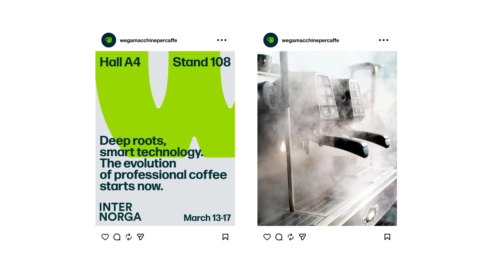
A contemporary rebranding designed to strengthen Wega’s recognisability through a more international, technical and distinctive visual language.
Overview
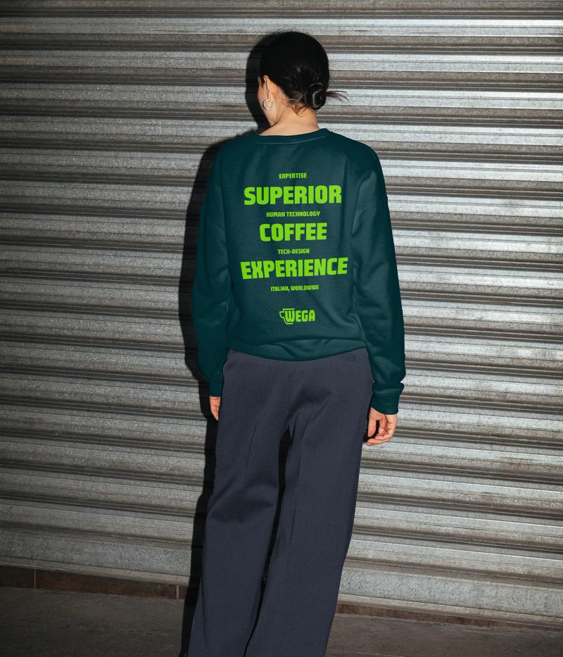
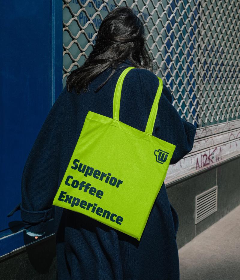
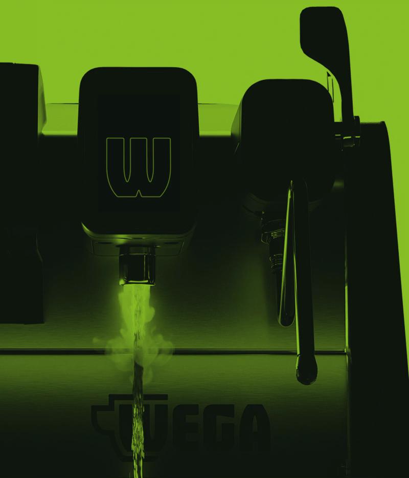
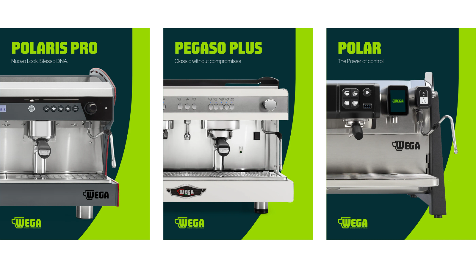
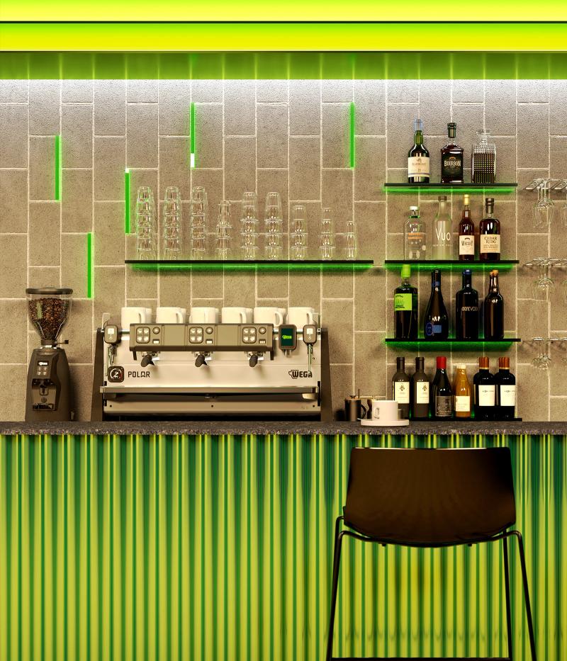
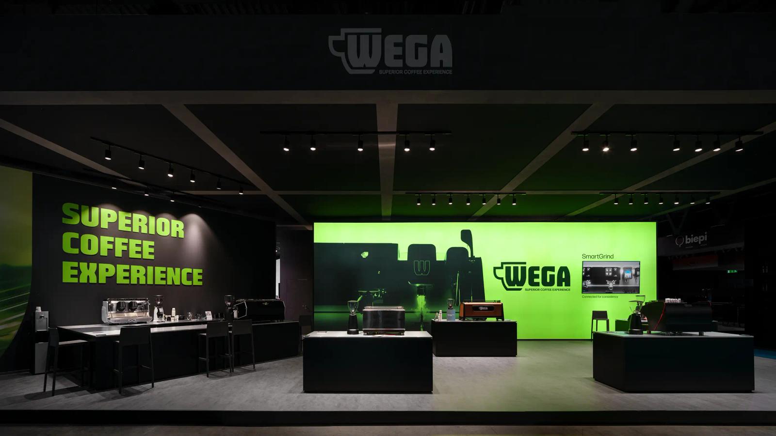
The project redefined Wega’s identity starting from its most recognisable heritage elements. The iconic cup-shaped monogram was redesigned to improve reproduction across industrial applications, while Wega Sans, a custom typeface derived from the geometry of the original logo, became the foundation of a coherent visual system spanning communication, product naming and exhibition environments. A vibrant green-led palette, updated machine nomenclature and a more flexible graphic framework established a scalable identity capable of adapting to technical communication, trade fairs and digital touchpoints. Conceived to bridge industrial engineering, Italian design culture and contemporary coffee experience, the system provides Wega with a stronger and more recognisable presence across every application.
Services
- Art Direction
- Exhibition
- Identity
- Strategy
- Web






Team
Andrea Bergamini, Partner
Michele Marchetti, Partner
Francis Needham, Partner
Elena Galante, Designer
Luca Argentieri, Developer
Margherita Schiavon, Developer
Alessandro Beghelli, Project Manager
Ilaria Ponti, Social Media Manager
Credits
Stack
- Nuxt
- Sanity
- Netlify
